MyGUI #2: Advanced behaviours & limitations
Previously on MyGUI
I presented the system of dynamic anchors that allowed an element of the GUI to use positions or sizes based either on a percentage of the window either on a fixed pixel size. I also explained a bit how it works under the hood. You can check the whole post here.
Dynamic Anchors
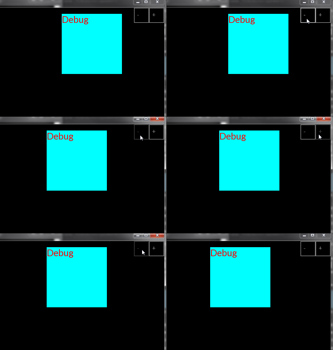
That system to represent the sizes and positions allowed me to create a dependence on the position of another anchor. An anchor can now depend on another’s position. This allows the user to create a unified widget out of multiple different components such as a modal with a line of text and a button. In order to do this, I implemented a system of observers in the Anchor class so when the window is resized or the anchors are changed, they will notify their observers so they can make the change too. This is particularly useful when you want to make a widget that can be moved with his inner components together.
 The red Debug text has its anchors relative to the cyan rectangle.
Responsive Skinning
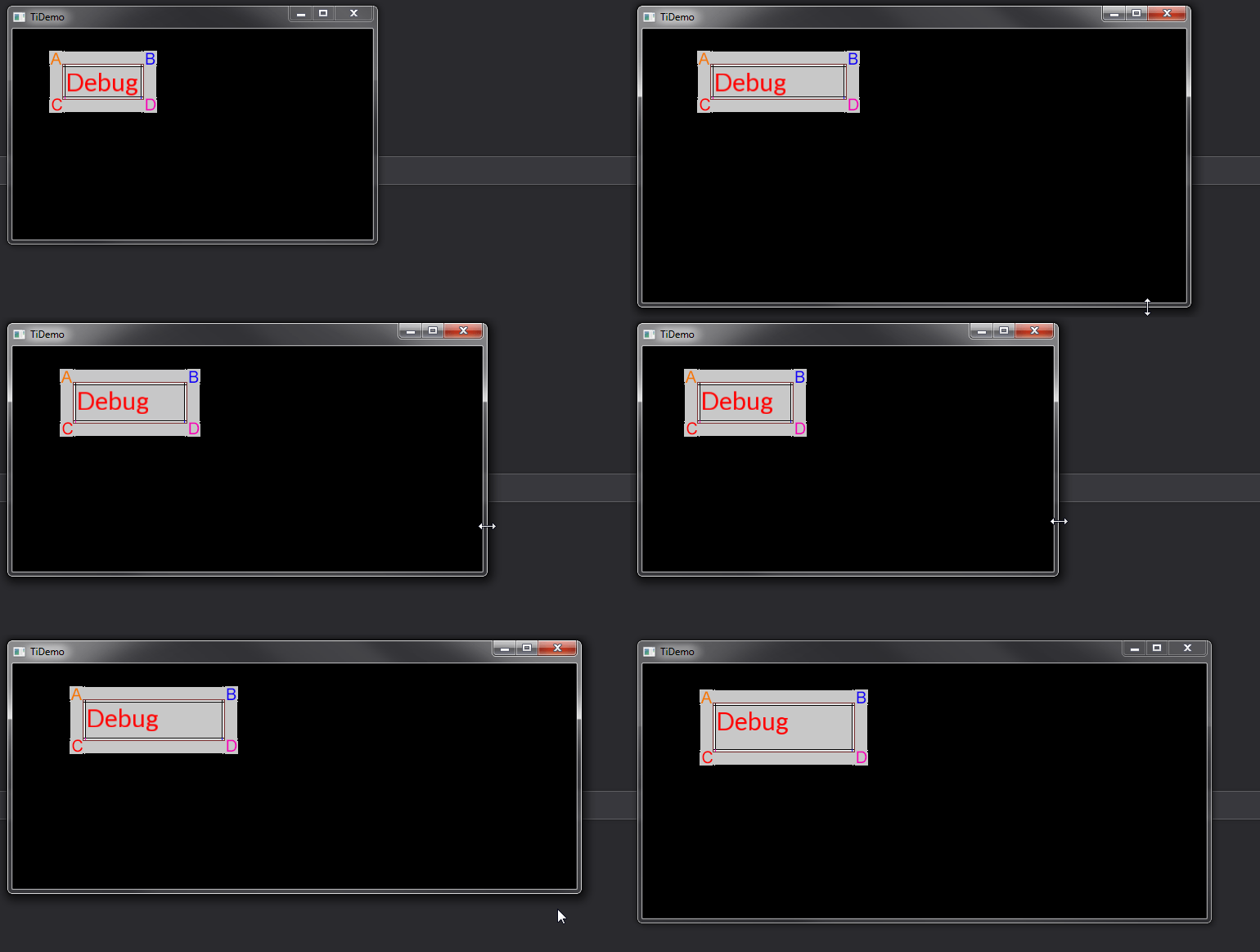
Since the GUI is supposed to be adaptable to any window size, the skinning of the GUI elements should be able to stretch without loosing its look. My solution to this is similar to the way the Unity Engine handles its GUI components. It takes a texture and then splits the texture in 9 different parts. Each part is used at a different place of the element. The sprite is split in a way that a pixel is left at the middle of each part. That way when the middle parts are stretched it will not look different because it is only one pixel. Here is an example with a sprite having a letter in each corner.
 Regardless of the size of the window, the letters in the corners stays the same size.
While this is pretty handy to have components with responsive styles, this comes at a cost. For some components like a button it requires 3 different skins, one for the basic state, one for the hover state and the other one for when the user is actually clicking on the button.
Current limitations
The Anchor system is way too complicated and requires a factory to complete all the parameters in a simple and quick manner. An other issue is the number of parameters a component requires. A simple button requires 4 anchors, 3 skins, 3 colors and more…
1 | ActionButton(sf::RenderWindow &, const std::function<void()>, |
It’s not that good, it makes the process of creating the elements way too complicated. The same goes for the component interface that every component is supposed to have. Some components require being able to react specifically to some events so more methods are added to the interface but that only creates more methods that aren’t used in already existing component or simple ones. Here is what this interface looks like at the moment this post is published:
1 | class IComponent |
Adding to the cost of having to handle so many parameters or so many useless methods when creating a new UI component, the developer has to store and handle the Skin objects and carry them everywhere he wants to create a new component or widget. This also prevents the creation of a default look for the GUI. Some application might not require such advanced behaviour regarding the skinning of the GUI elements.
Takeaway
I am not satisfied with the result of this GUI engine and I’ll probably start over a third time but like the last time, I learned a lot while doing so. I am not sure yet if I’ll make this attempt open-source or not, but I probably will in some time. Here are the things I’ll try to avoid when creating the next iteration of my GUI engine:
- Way too many methods in the component interface.
- Creating a simple component is too complex.
- Lack of default theme.
- Using Visual Studio as only build reference for the project.
An other thing I would like to keep in mind for the next version is the ability to use the GUI engine in a simple SFML project without requiring the states system I started with. That way, anyone could use this GUI library without as much restrictions. I hope you enjoyed this post :).
-Tym